Friday, May 2, 2014

Rocket Entertainment (Project 4)

For my assignment, I created a logo, letterhead, and business card for Rocket Entertainment, a game design company made by Jonathan Alexander.

Logo:


Logo (Greyscale):


Sample Business Card: 


Sample Letterhead: 


Tuesday, April 22, 2014

Starbucks Makeover Article Response

I think the Starbucks logo redesign is a fairly smart choice.

It isn't a massive overhaul, and keeps what made it unique and recognizable, and actually manages to make that portion (the siren/mermaid) more prominent.

As it stand, many people in the US understand what Starbucks is and what it looks like, so removing the name is essentially just getting rid of something that is not necessarily needed all that much anymore.

It's akin to a name-tag on the first day of school. Eventually you won't need it anymore because anyone who will be bothered to remember your name, will know it without that reminded there. In this case, Starbucks has decided to leave the first day of school behind.
Logo Redesign


I chose to redesign the logo for Dunkin' Donuts.

Basically, I tried to go for something reasonably minimal and easy to read, that retains enough of the original logo's identity so as to make it recognizable as the same company.

While the old logo was alright, I felt it could use some tweaking to become something a little more iconic looking in the same vein as Starbucks, a simple shape that is easily readable while simultaneously being memorable.

Thursday, March 13, 2014

Movie Poster Project Plot Description

The movie I want to make a poster for will be a Sci-Fi movie.

The basic premise is that there are evil aliens out in space trying to take over the galaxy, and humans are trying to stop them with various advanced technology like spaceships and giant mechs.

The poster will more than likely be a view of the Earth with ships and things in the background, as well as whichever actors and myself faded in the back, somewhat in the style of old posters for adventure movies like Star Wars.

Movie Poster Analysis


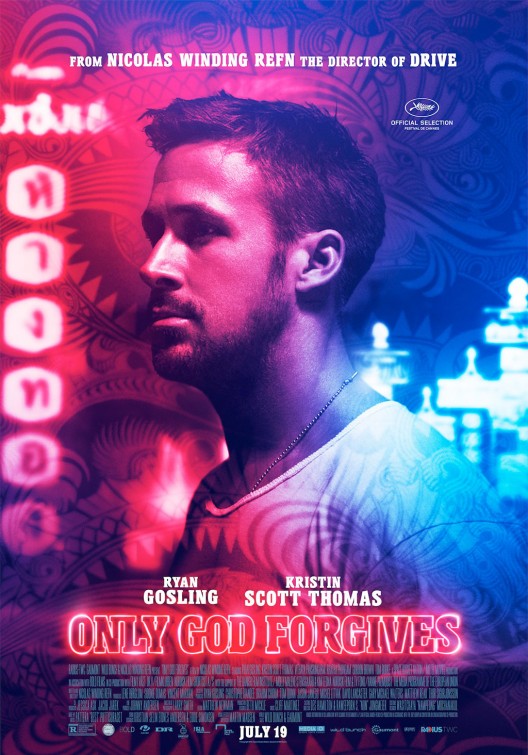
http://www.impawards.com/2013/posters/only_god_forgives_ver6.jpg


 The movie poster Nicholas Winding Refn's 'Only God Forgives' is one of my favorites. The coloring on it is really nice, with a sort of neon feel to it, to go along with the title being stylized as a neon sign. It also fits with the movie being set in Bangkok where a lot of bright lights and typical "big city" features are. I also really enjoy the tattoo sort of overlay in the back that looks really similar to the pop-culture Asian art style. Overlaying all the coloring onto Ryan Gosling's profile is a nice touch too, since a lot of poster designs don't do that, which causes the composition to be that much weaker.

NOTE: I apparently left this in my drafts folder for a couple weeks without bothering to hit publish, figured I would put it up now in case I might still be able to get credit.

Tuesday, February 11, 2014

How to Ruin a Great Design (Reaction)

I agree with the author of the piece on the premise that iconic and clean designs need not change. For the most part, the designs she cites as being changed were all changed for the worse or for arbitrary reasons. At the same time, I can't help but disagree that changing logos is usually a bad thing. I like when some companies clean up their logo/product design every now and then. Apple is a good example, where they keep a lot of the essence of the product, but put just enough of a new spin on it that it stays fresh and doesn't have a design that ages out. Additionally, I think that more companies could benefit from trying to future-proof their designs, so that there is less need for drastic change.


As far as the street signs are concerned, I wholeheartedly agree. Most road signs are simple and easy to understand in their current forms, so there should be no need to change.

Friday, February 7, 2014

Robot And Cat Surfers In Space (Photoshop Tutorial 2/7/14)


Functional and Non-Functional Products

The functional product I came up with is an app/program for TVs and computers. Basically, it is wirelessly connected to a camera that is installed in the side of the user's oven. This allows the user to check on the food they are cooking from their phone or a picture-in-picture screen on the TV, without getting up from the couch or moving from wherever they might be around the house. For added functionality it also displays the remaining minutes on the oven's timer, as well as what the current temperature of the interior is.

The non-functional product I came up with is a hat, similar to a soda/beer drink hat, that is used to store ice cream. The reason it wouldn't be functional is that it has no proper way of keeping the ice cream cold, so it will eventually melt and end up dripping and pouring all over the place, causing a big mess. I'm also considering making it so that the hat itself is a waffle cone or something like that, for added ridiculousness in appearance and even further non-functionality since most waffle cones are very fragile.

Thursday, January 30, 2014

Homework Assignment 1

I really like the design of the Nintendo 3DS. Since it is a portable device, it is made to be fairly small mobile. The folding function on it allows it to become more portable than it would be normally, while still retaining the functionality of the overall device. It comes in a variety of colors and styles which is nice, since it allows the owners to select something other than the typical black or white gloss design of other mobile tech devices. The interior button placement and screen set up is great as well, since it is able to be used comfortably, rather than having to sacrifice that aspect for portability, another achievement of the half-fold design of the casing. In general, the design is incredibly clean and functional, which are the two most important aspects of physical product design.

Design pictured below:

http://whatculture.com/wp-content/uploads/2012/01/nintendo-3ds.jpg

Friday, January 24, 2014

Answers


  • What is your computer experience?
    • I know the ins-and-outs of computers pretty decently. I mostly use my personal computer to play games and as a result have had to tweak a bunch of stuff every now and then to solve technical problems.
  • What is your experience with Photoshop and Illustrator?
    • I've used Photoshop a few times before and can work it pretty well, but I don't think I've ever used Illustrator.
  • Do you have a computer at home? If so does it have Photoshop and Illustrator?
    • Yes, I have a computer with Photoshop, but not Illustrator.
  • What is your major?
    • Liberal Arts
  • What do you hope to get out of this class?
    • Skills with design for Photoshop and whatever else so I can better make art assets for whatever projects I might want to do.
  • Who is your favorite artist?
    • It's a tie between Olly Moss and Jock who have both done a bunch of cool posters and comic book covers/art
  • Who is your favorite musician?
    • Arcade Fire
  • Tell me something interesting about yourself.
    • I won a contest once where a prop idea I drew and submitted got put into a movie.
  • Write a five line story.
    • There once was a line.
    • Who was friends with four other lines.
    • They went on adventures and had lots of fun.
    • And all of that was because of a pun.
    • I should probably not take things so literally.
  • Post an image